our brand
A brand is more than a logo, a slogan, a mascot, or an ad campaign. It’s long-lasting, with enduring strength. Each component of our brand illustrates who Providence College is and why we matter to the world.
Identity
The Providence College logo is the simplest representation of our visual identity, so it’s important to ensure its consistent use across media in order to build a strong, cohesive brand. Only use authorized digital art files when applying the logo to communications or materials. Do not attempt to typeset or recreate them yourself.
Providence College Logo
To keep the logo prominent and distinctive, we take care when positioning it in proximity to other graphic elements. To preserve the logo’s legibility in print communications, we observe certain minimum sizes. For the vertical version, the minimum width is 1 inch; for the horizontal version, the minimum width is 1.35 inches. The minimum spacing around the elements is equal to one letter size.




The College Seal and Torch
The College’s official seal is generally reserved for formal documents such as diplomas, certifications, transcripts, awards, and official correspondence. It is often associated with the president’s office. In certain instances, the torch mark can stand alone in our communications. The flame component can also appear on its own with the horizontal element shown here.




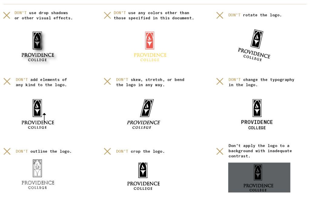
Things to Avoid
Avoid these pitfalls when using the logo.
VISUAL BRAND
Beyond our basic identity, our brand comes to life through our visual language: a careful combination of typography, color, graphic elements, and photography.
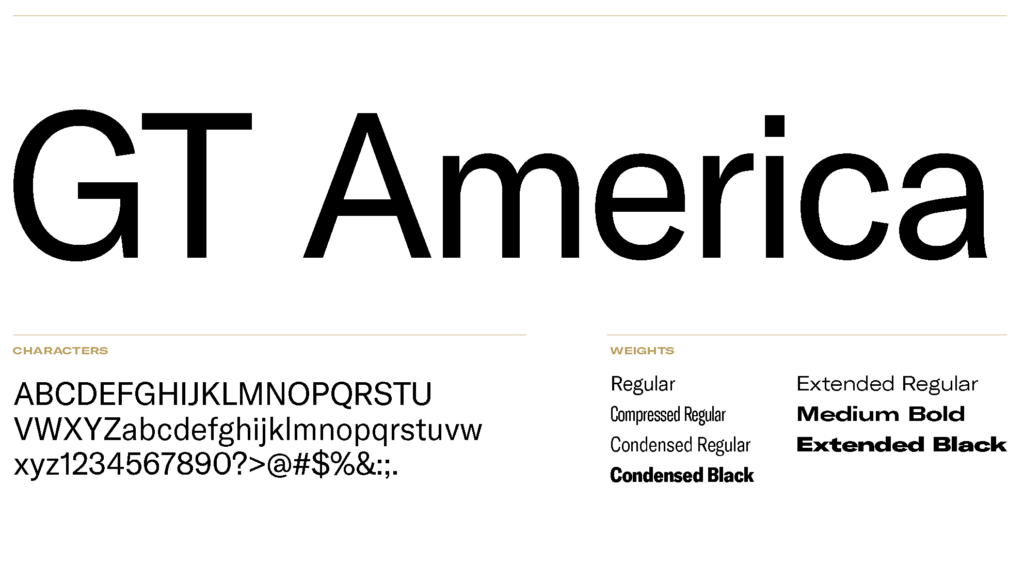
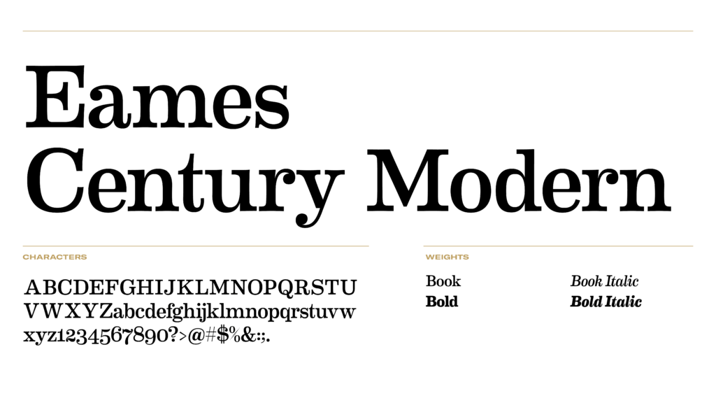
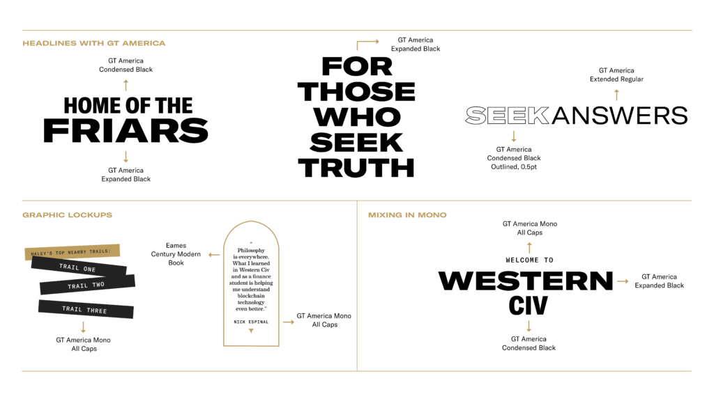
Typography
When it’s used thoughtfully, typography is a powerful brand tool that can further expand on the meaning of what we’re communicating. Our brand’s typography is clear, accessible, and flexible for a wide range of situations.
Color
Our palette has three layers: primary, secondary, and accent colors. Our communications lean heavily on the primary palette; we use colors from the secondary and accent palettes sparingly to add dimension and keep layouts visually interesting.
Providence Black
HEX #000000
RGB 0,0,0
CMYK 0,0,0,100
White
HEX #ffffff
RGB 255,255,255
CMYK 0,0,0,0
Cool Gray
HEX #a3a19e
RGB 151,152,154
CMYK 0,0,0,45
Pantone PMS 877 Metallic or PMS Cool Gray 7
Providence Gold
HEX #bd9e5e
RGB 189,158,94
CMYK 20,30,70,10
Pantone PMS 871 Metallic
Harkins Yellow
HEX #fcfade
RGB 251,250,224
CMYK 1,0,15,0
Pantone N/A
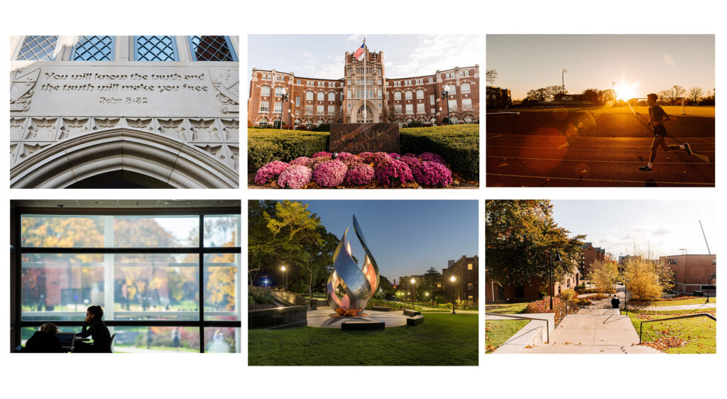
Photography
Photography plays an important role in our brand communications because it tells our story visually. Although our words are compelling, images go further to offer powerful proof of what we say.


